(01)
The Brief
A new restaurant concept from a proven operator — launched in the middle of two simultaneous crises.
The owner behind Shogun, Fleur de Lys Catering, and several other successful concepts came to us with something new: a Mediterranean restaurant on the coast of Jounieh, rooted in Lebanese heritage. The brief was to build the brand from scratch. What nobody accounted for was that by the time we were delivering, Lebanon was in the middle of a financial collapse and a global pandemic at once.
(What we did)
- Brand identity from scratch
- Brand positioning & naming
- Menu system design
- Digital contactless menu
(02)
The Diagnosis
The brief changed every week. Currency fluctuation meant menus had to change daily. Nobody was touching physical menus.
Two realities collided at once. The economic crisis meant prices were being updated daily — a printed menu was obsolete before it came off the press. COVID meant people wouldn't touch shared surfaces at all. A traditional F&B launch would have been dead on arrival. Every assumption we started with had to be rebuilt.
(What we did)
- Crisis-context brand audit
- Physical vs. digital touchpoint mapping
- Menu system flexibility analysis
- Contactless solution scoping
(03)
The Idea
Go back further than the crisis. Root the brand in something older than all of it.
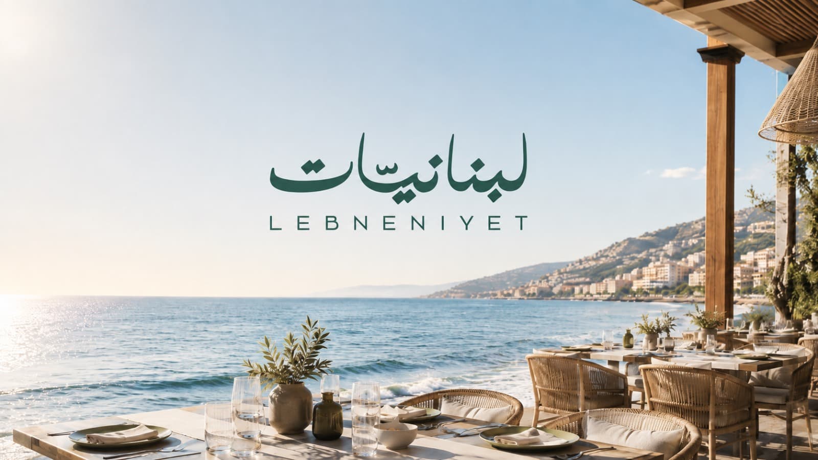
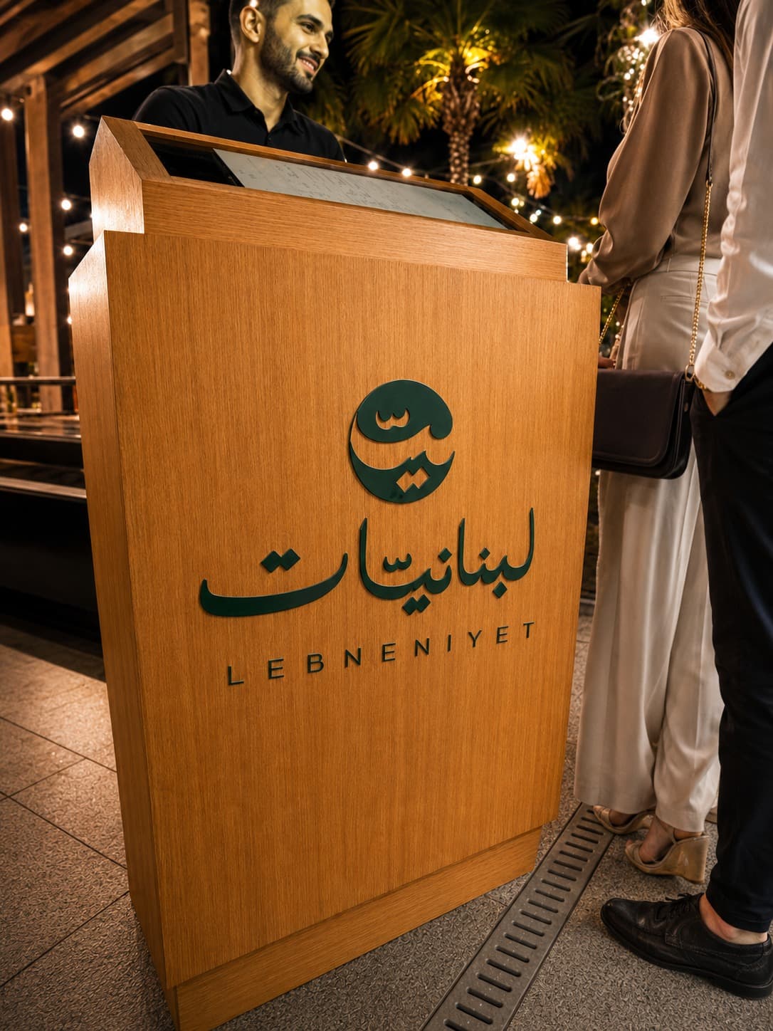
When everything around you is shifting, you build on what doesn't move. Lebneniyet sat on the coast of Jounieh — the same coastline the Phoenicians sailed from thousands of years before any economic index existed. The brand was anchored there: in the boats, the sea, the idea of Mediterranean civilisation as something that outlasted every crisis it ever faced. And practically, the digital menu became the brand's first real innovation — a QR-based contactless system that solved the price-change problem and the hygiene problem simultaneously.
(04)
What We Built
A brand rooted in Phoenician heritage, built for a contactless world.
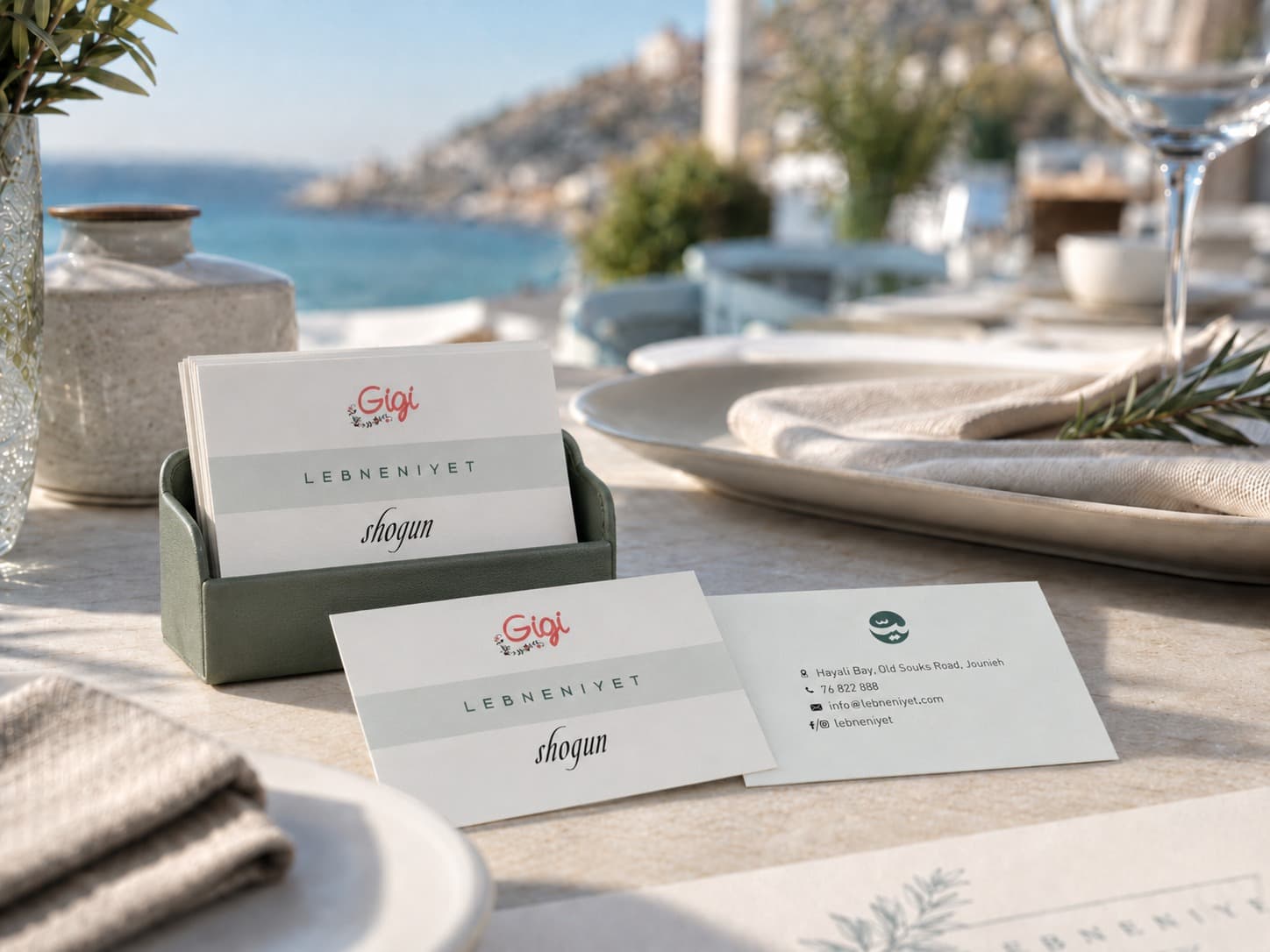
The visual identity drew from Phoenician seafaring — the boats, the coast, the deep blue of the Mediterranean. Every design decision was made to feel timeless rather than trendy, because the brand needed to outlast the moment it was born in. In parallel, we built a digital menu system that could be updated in real time, required no physical contact, and was built to reflect the brand's premium positioning.
(What we did)
- Logo & visual identity system
- Colour palette & typography
- Menu design system (digital + print)
- QR-based contactless digital menu
- In-restaurant brand touchpoints
- Brand standards guide
(05)
The Result
A brand built for the worst possible conditions — and built to last beyond them.
Lebneniyet launched with a full visual identity and a contactless menu system that was ahead of the market. The brand didn't just survive the crisis — it was designed around it. The Phoenician roots gave it a story that no fluctuating exchange rate could touch.
(What we did)
- Launch-ready brand system
- Digital menu live and updatable in real time
- Brand positioned for longevity, not just launch
(Start a project)
Let's build
yours.
Every brand we've built started with one honest conversation. Ready to have it?
Let's Sync.→